The Home Depot - App | Feature Redesigns
🍎 https://apps.apple.com/us/app/the-home-depot/id342527639
🤖 https://play.google.com/store/apps/details?id=com.thehomedepot
🍎 https://apps.apple.com/us/app/the-home-depot/id342527639
🤖 https://play.google.com/store/apps/details?id=com.thehomedepot
1. Shop Tab Redesign
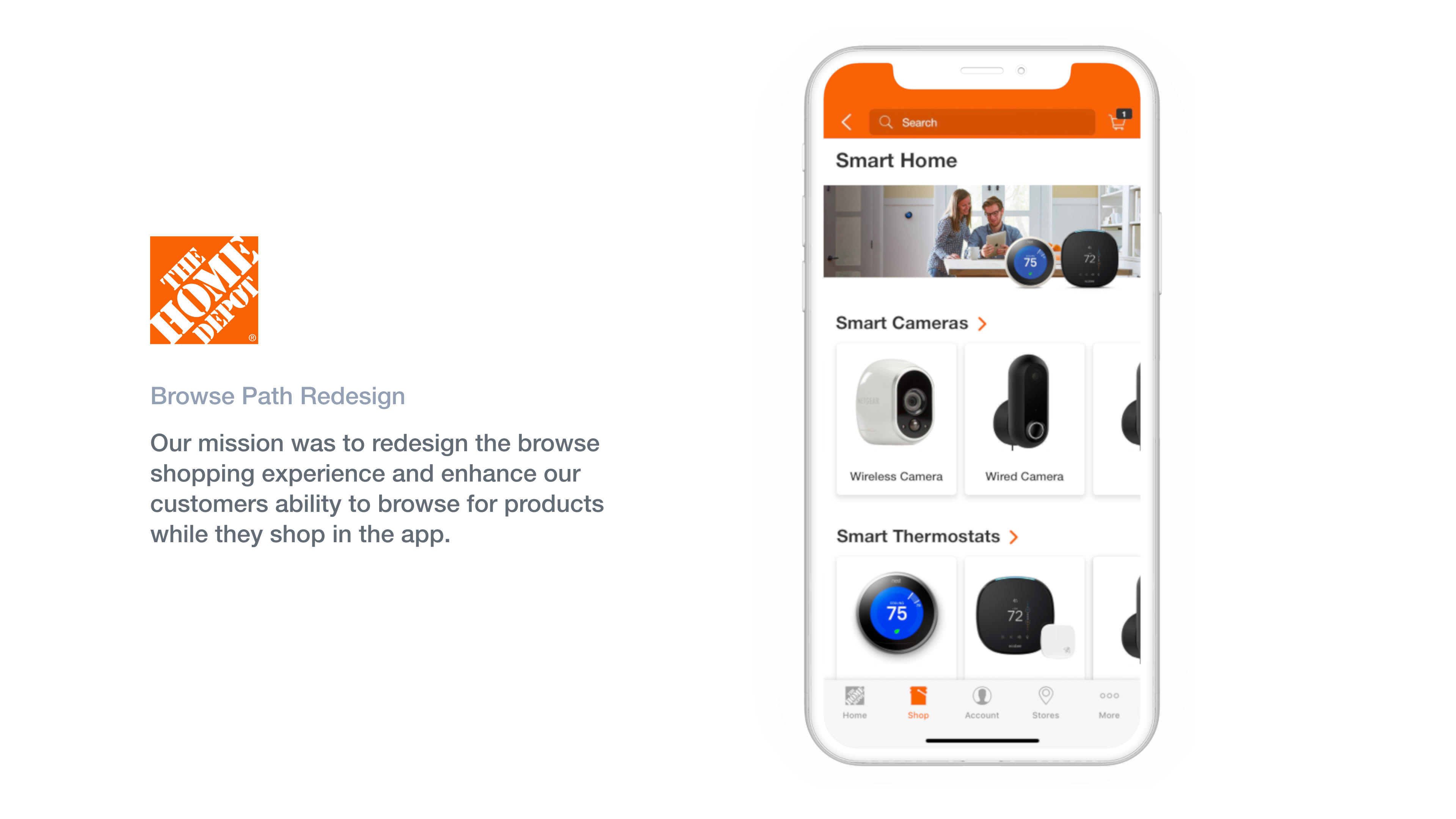
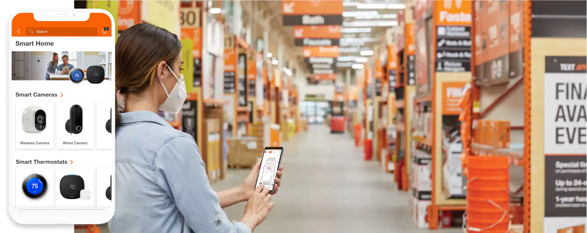
Problem: The Browse (Shop Tab) experience was very dated and difficult to navigate through without much visual reference for the path you were taking, or the products you were navigating through. There isn't a "real Browse Path"
Solution: Design a more streamlined process to get more users to guide themselves to Product Listing Pages without much frustration.
Solution: Design a more streamlined process to get more users to guide themselves to Product Listing Pages without much frustration.
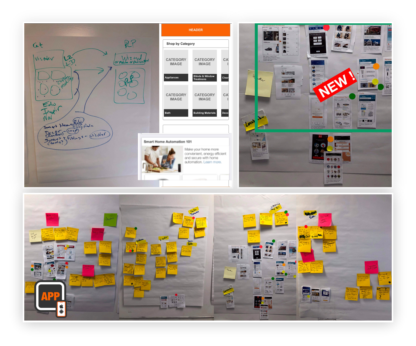
Ideation / Affinity Mapping, Sketches, Wireframes
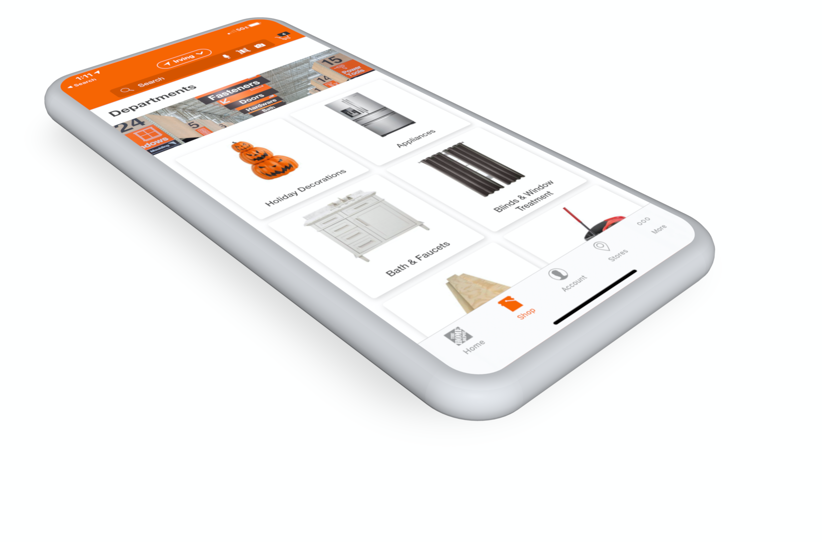
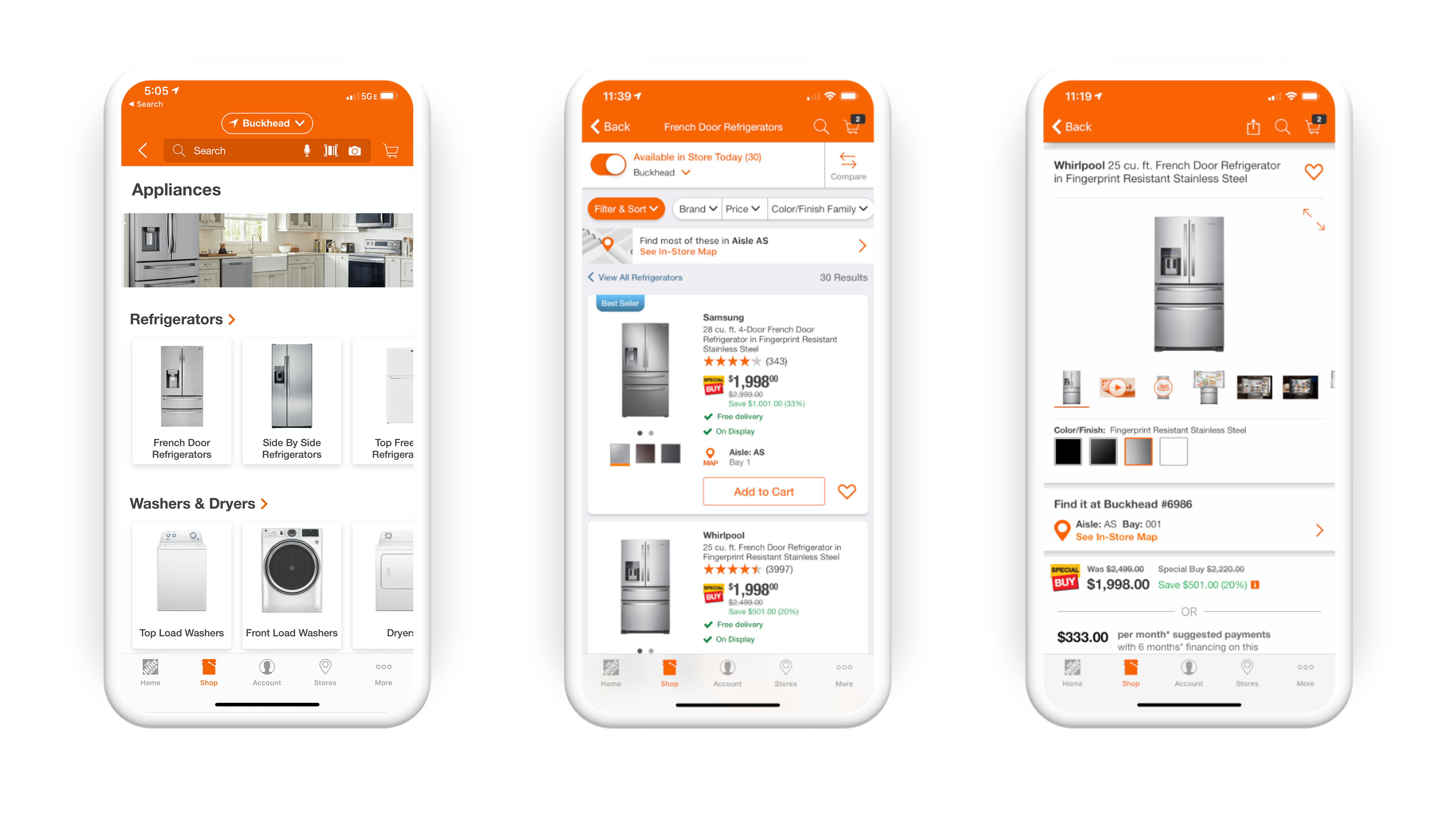
All Departments Screen
When the user taps on the Shop Tab, the first screen shown is All Departments
Category Page Screen
When the user taps on on a Category, the are presented with each sub category in a smooth carousel so they can browse products with visual representation of the product

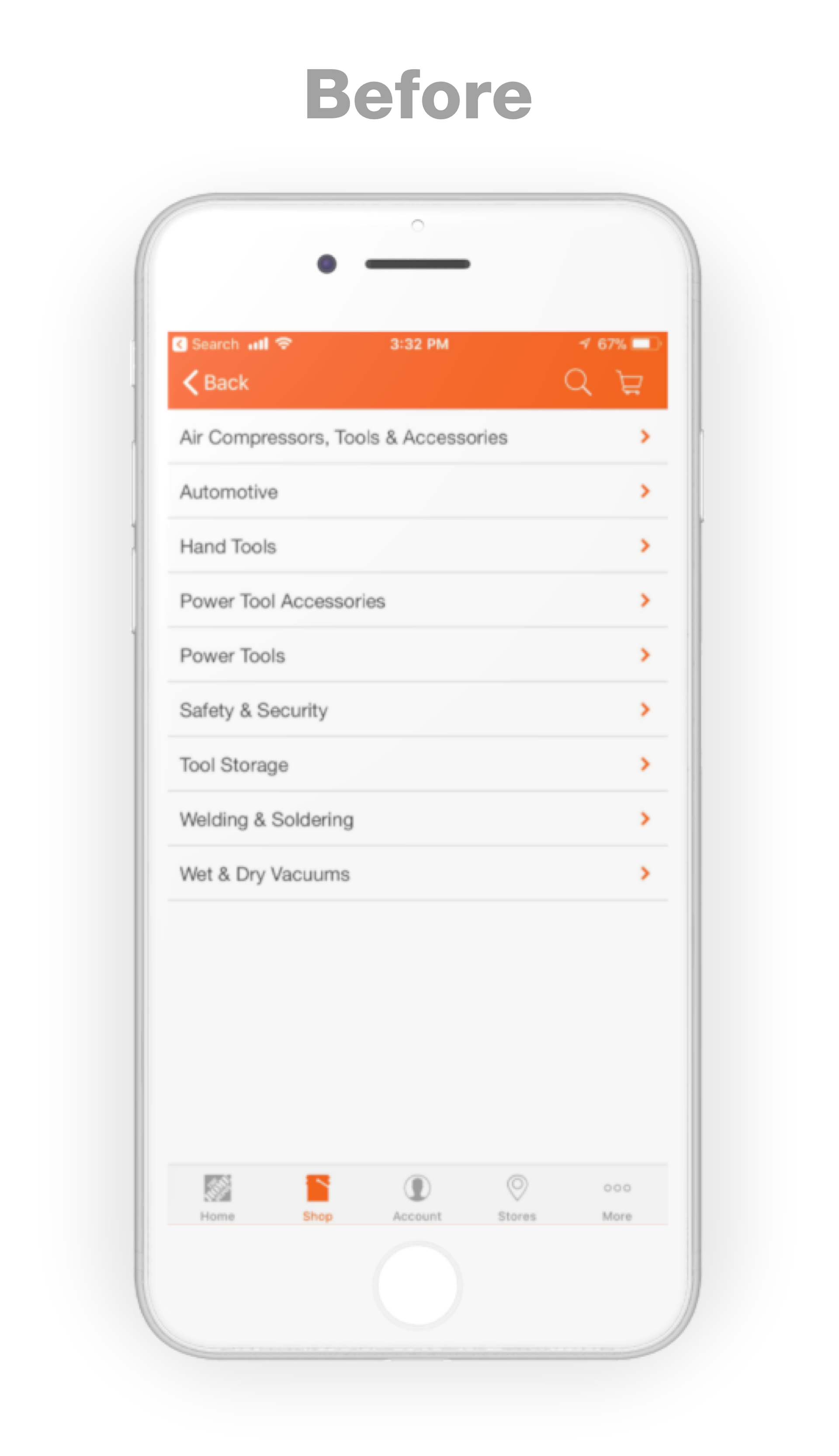
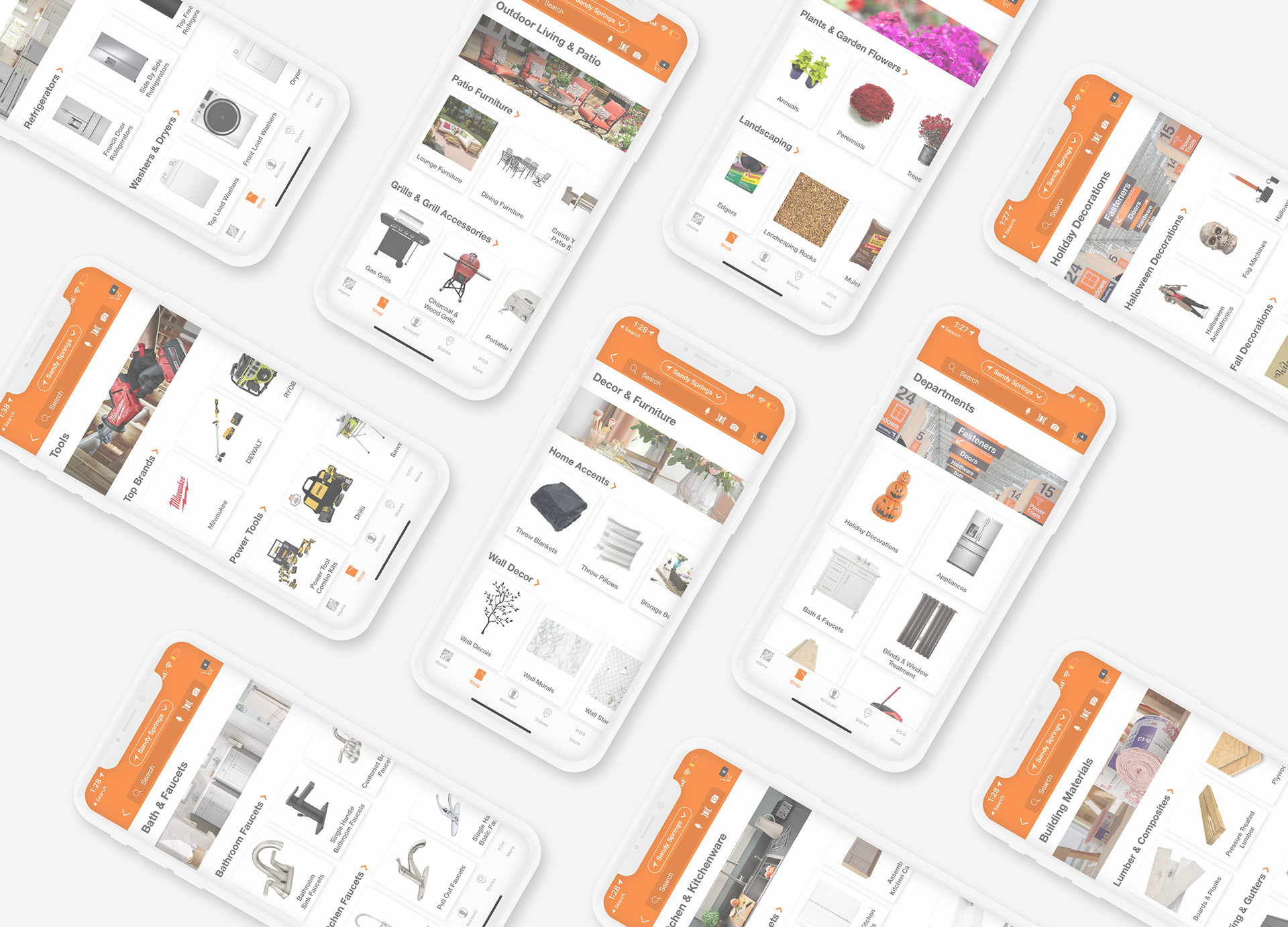
Category Pages were full of pure List Links with no Visual Elements Showing what the Product is
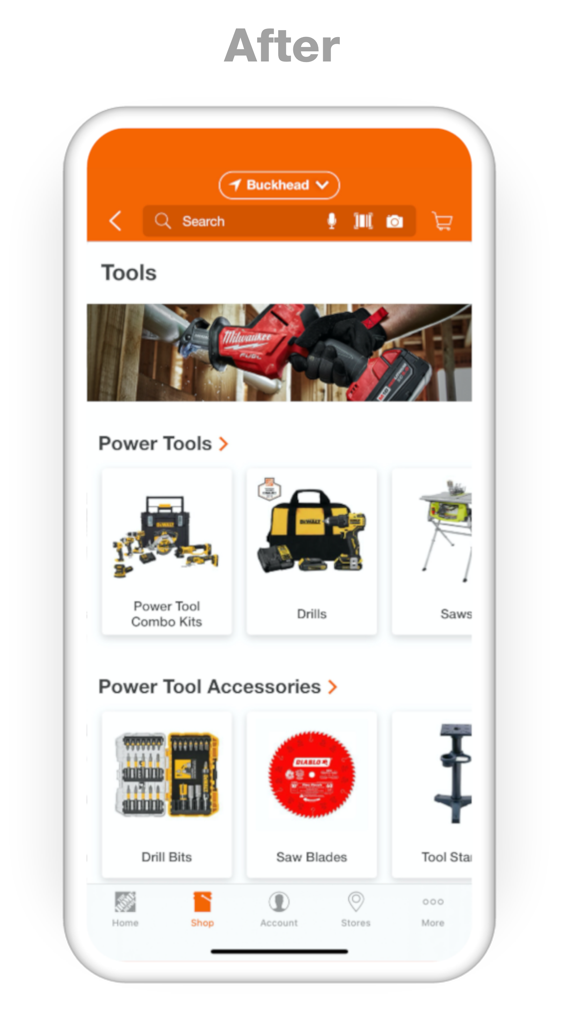
Category Pages now have Visual Elements, showing what the Product is that they are looking for, helping the users shopping experience. We also consolidated the categories by combining L2's with L3's, saving clicks (taps) for the user
Path To Product Listing Page
Creating a Design System

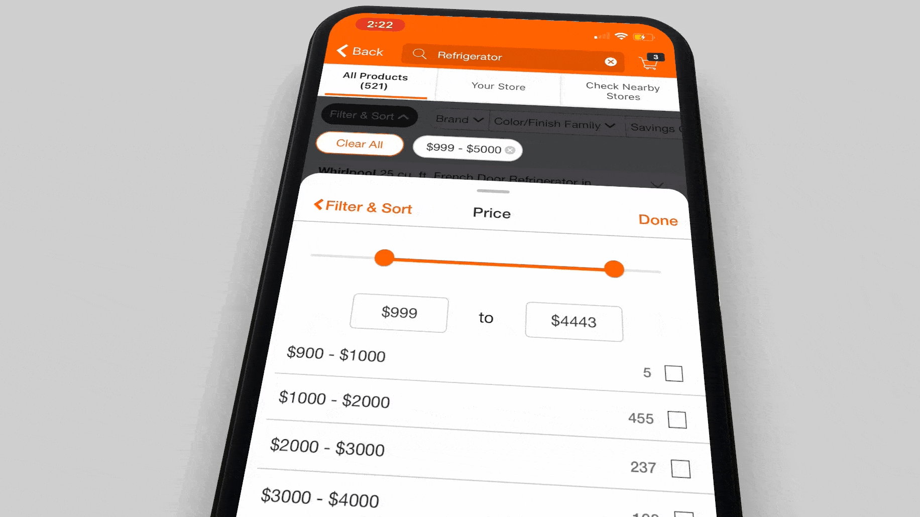
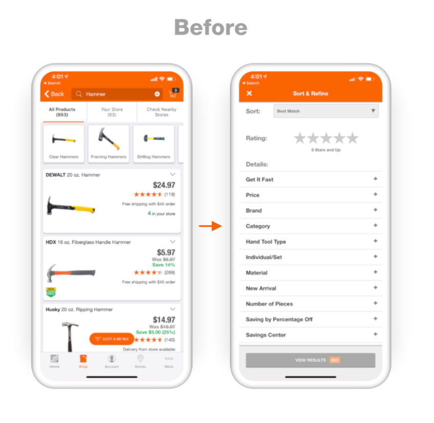
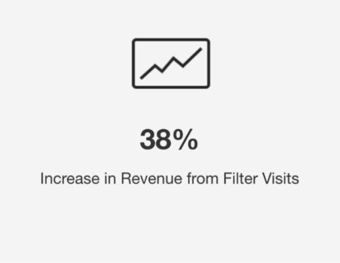
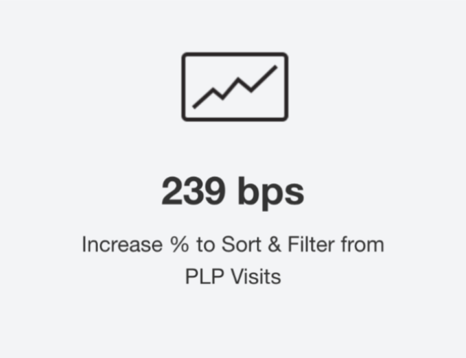
2. Redesigning Filters in the App

Augmented Reality
in the App
I designed an Augmented Reality Landing Page that showcased how AR is Used in the App.
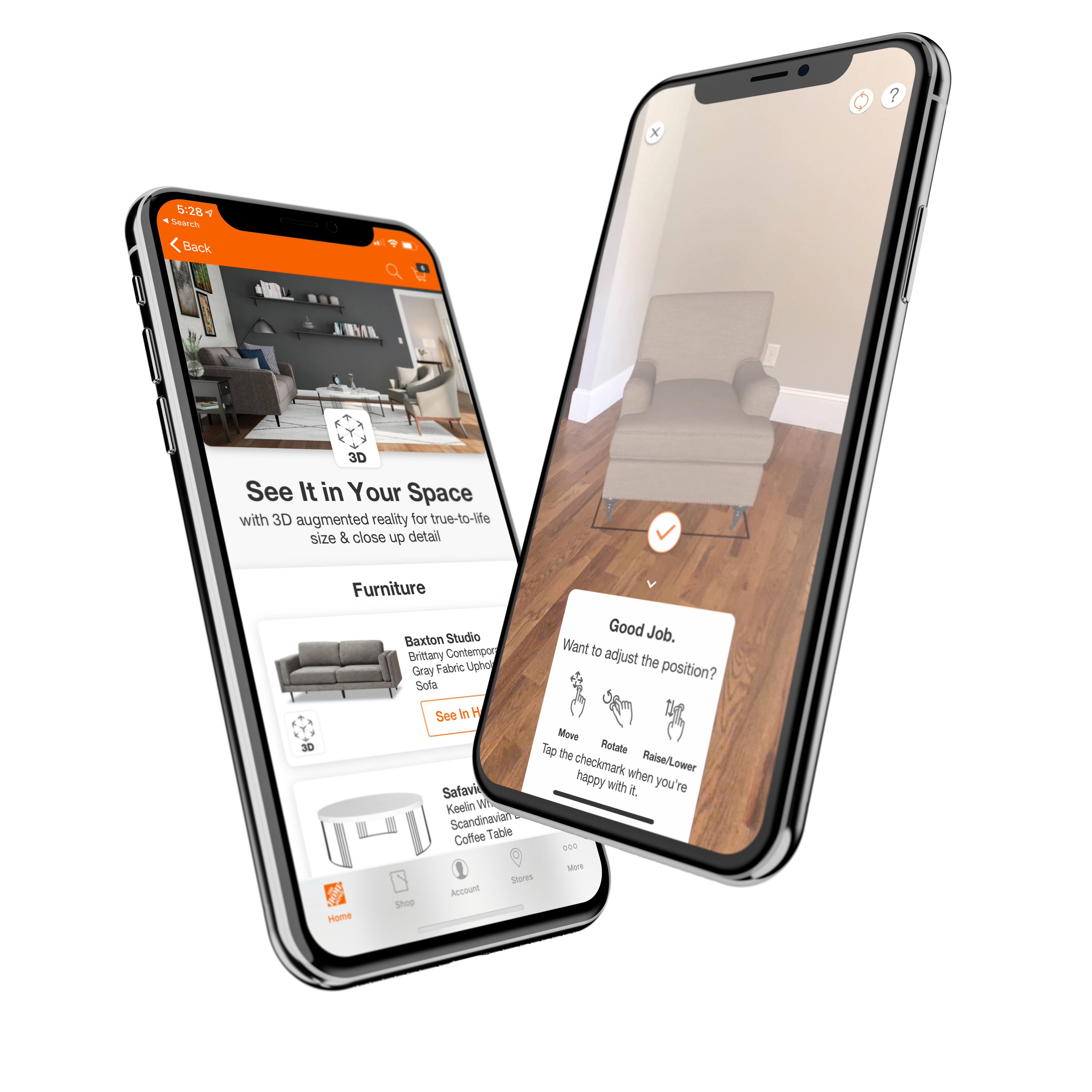

This feature was displayed in a Home Depot Commercial during the 2019 College Football Playoff game that drove customers to download the app, and was also the launch of our new brand campaign
"HOW DOERS GET MORE DONE"
"HOW DOERS GET MORE DONE"
Browse Path Deck
The team participated in a 4 day design sprint as the start to this project to determine a direction that was user centered


